Bye Bye New Jersey! Mapping Migration Data
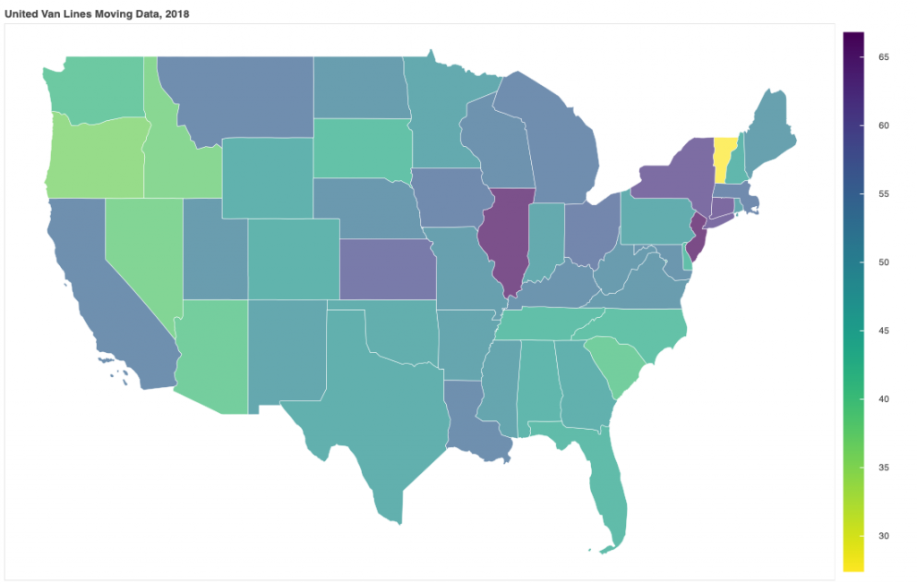
In this post I look at the data released by the United Van Lines. Earlier this month (January 2019) United Van Lines issued its annual movers study for 2018 and my home state of NJ topped the list for most outbound moves. Using the data I created a heat map to visualize the results. Having lived in New Jersey the results of such data come as no surprise. New Jersey ranks the highest in the nation in property taxes, sixth highest income tax and tenth highest in real estate prices. The only thing that was helping the Jerseyan consumer was the low gas prices but its state legislators managed to screw that up when in 2016 they increased the gas tax by a whopping 23-cent-per-gallon. New Jersey motorist went from enjoying the second-lowest taxed gasoline in the country to the sixth highest. In 2016, New Jersey’s “most valuable” resident, hedge fund billionaire David Tepper, moved (along with his company) to Florida, a state with no income-tax, depriving the state in hundreds of millions of dollars in lost payments putting the state’s budget at risk.
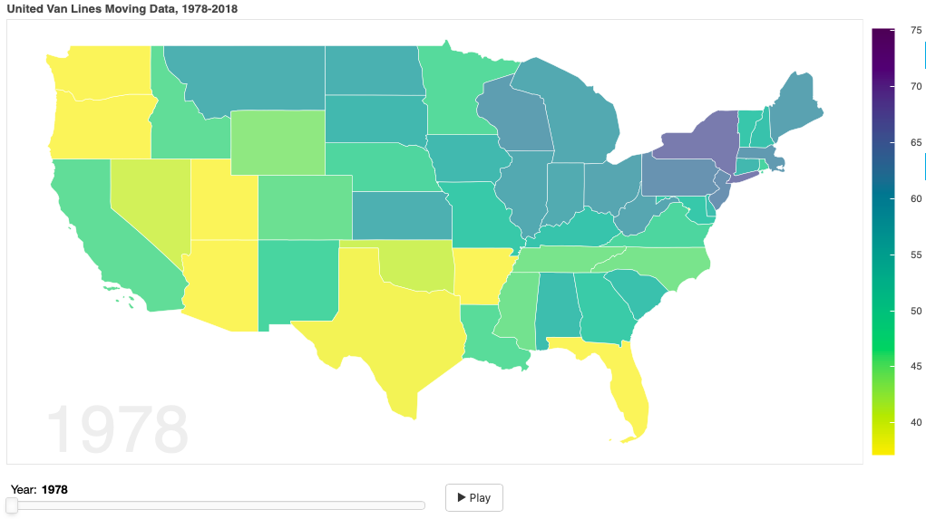
I reached out to Vanlines and they were kind enough to provide me their historical moving data since 1978. I animated that data by modeling it over time. It provides a visual to see moving data trends over the years. Simply hit the play button after opening the app below (click on image).
The Wall Street Journal reported that New York City’s population dipped for the first time in 2018 in over a decade. The high costs of housing and poor schools are cited as main reasons why people are moving.
source of data: https://www.unitedvanlines.com/contact-united/news/movers-study-2018